South Korea's National Vaccine Certificate App
South Korea's National Vaccine Certificate App
Digital Public Health
Digital Public Health

O V E R V I E W
COOV is a national vaccination certificate app developed during the COVID-19 pandemic in South Korea.
The product scaled to over 43 million users, supported millions of daily verifications, and became a critical infrastructure for enabling safe access to public spaces.
COOV recognized the iF Design Awards for Service Design and was awarded the Presidential Award at the Excellent Cases of Government Innovation.


Role
UXUI Designer
(end-to-end UX and UI)
Tool
Figma, FigJam, Notion, Jira, Miro
UX & UI Design
Team
2 UX/UI Designer, 2 Front Eng, 2 Backend Eng, PO, 1 QA, Government (KDCA)
Timline
Pandemic rollout and iterative releases (multi phase)
Challenge
How might we design a national scale vaccination certificate app that gives people control over their medical data while making it easy to submit and verify in fast paced, high volume real world situations?
During the COVID-19 pandemic, South Korea needed a reliable way to verify vaccination status at scale. Existing paper based systems were slow, error- prone, and difficult to trust in real world scenarios like airports, restaurants, and public facilities.

Solution
I approached this by designing a connected experience that brings the offline vaccination journey into a digital, card style certificate, so it feels familiar and trustworthy. It uses QR-based verification for fast and accurate checks, while letting users choose what information they want to share.
I approached this by designing a connected experience that brings the offline vaccination journey into a digital, card style certificate, so it feels familiar and trustworthy. It uses QR-based verification for fast and accurate checks, while letting users choose what information they want to share.
During the onset of the COVID-19 pandemic, the problem with physical paper vaccination cards was that they were fragile and posed significant privacy risks. If lost or exposed, sensitive personal health data could be easily compromised.
At the same time, public health authorities needed a way to respond quickly to outbreaks and verify exposure risk. The challenge was to design a product that could support public health response efforts while protecting citizens’ personal and medical data.
Rather than enabling broad surveillance, the system was designed to limit data exposure, ensure consent based verification, and allow traceability only when legally required under strict governance controls.

My Role - UXUI Designer
My Role - UXUI Designer
As a UX/UI Designer responsible for end-to-end UX/UI, from concept to launch, I led design wireframes, user research, user interviews, the design system, and UX writing.
For four months of building, I collaborated closely with government stakeholders and engineers to define product direction and align with frequently changing medical policy restrictions.
Approach
Defined direction through clear product principles.
I approached this project by focusing on what would make the system actually work in real life for people's daily life in pandemic emergency.
I approached this project by focusing on what would make the system actually work in real life for people's daily life in pandemic emergency.
Designed For Trust In Real Situations
Made digital vaccination certificates feel like something users truly own in the app, similar to holding a paper certificate after vaccination, while ensuring the status is easy to understand at a glance in high pressure environments like airports or restaurants.
Balanced Speed And Security
Chose a dynamic QR code based flow for digital certification, enabling fast verification proof while maintaining security and reliability.
Simplified Complex Requirements
Structured vaccination related medical information in a clear and consistent way, making it easy for users to understand at a glance.
Designed For Privacy And User Control
Focused on protecting users’ personal and medical information by enabling selective disclosure. Users could choose what information to share in offline verification scenarios, maintaining control over their data.
Surveys
Navigating with a compass of real user insight.
Navigating with a compass of real user insight.

I started with a lightweight survey to quickly understand patterns at scale and identify key areas to focus on.
The survey was conducted using Google Surveys with 128 participants, including both users who had been vaccinated and those who had not yet received vaccination. Questions focused on perceived trust, ease of presenting the certificate, and reasons for negative perceptions of digital certification.
I included scenario based questions, such as “What do think you will feel and do when the venue asks for a QR code to enter?”, to capture users’ mental models and expectations.
72% of respondents said they value one tap access to the certificate more than additional feature depth.
64% said they would trust the product more if it showed only essential personal information in public settings.
58% reported at least one moment of uncertainty about what to show when they asked for vaccination.
Low-Fidelity Wireframes
Exploring the full spectrum of UX possibilities.
Exploring the full spectrum of UX possibilities.

Based on these survey findings, I designed low-fi wireframes for key user flows, including obtaining a vaccination certificate, presenting it at venues, and verifying vaccination status between individuals.
I saw this phase as part of the creative process, where I explored multiple directions to find the best UX and match it with the best way to represent the UX in UI. Honestly, it’s one of my favorite parts of designing, which includes 30+ possible designs for each flow with deep thinking process. One of the goals of this process is that I should have touched every possible design for the UX, so I considered most of its possible cases.
I applied a one tap access approach to the vaccination card design.
For intuitive use, the primary vaccination certificate card and action buttons are immediately visible on the main screen.
To support privacy and control, I designed the system to include only essential information, allowing users to toggle specific details on or off before submission.
User Interviews
Learning from real user behavior.

I conducted semi-structured interviews with two primary groups: citizens who needed to present certificates and verifier position who had to verify them during peak hours. I recruited participants across different age groups and levels of digital comfort.
The goal was to understand how easily users could obtain a vaccination certificate, submit their information, and verify others, as well as how 'trust' was perceived in the moment through the design. I also explored what information users expected to see and where the flow broke down under time pressure. I used short, task-based prompts, such as “show your certificate as if you are entering a cafe,” to observe real behaviors rather than relying only on opinions.
Due to the urgency of the pandemic, I conducted research in parallel with early design, using wireframes prototpying and role play scenarios to simulate real world verification situations.
I conducted semi structured interviews with two primary groups: citizens who needed to present certificates and verifier position who had to verify them during peak hours. I recruited participants across different age groups and levels of digital comfort.
The goal was to understand how easily users could obtain a vaccination certificate, submit their information, and verify others, as well as how 'trust' was perceived in the moment through the design. I also explored what information users expected to see and where the flow broke down under time pressure. I used short, task-based prompts, such as “show your certificate as if you are entering a cafe,” to observe real behaviors rather than relying only on opinions.
Due to the urgency of the pandemic, I conducted research in parallel with early design, using wireframes prototpying and role play scenarios to simulate real world verification situations.
I conducted semi-structured interviews with two primary groups: citizens who needed to present certificates and verifier position who had to verify them during peak hours. I recruited participants across different age groups and levels of digital comfort.
The goal was to understand how easily users could obtain a vaccination certificate, submit their information, and verify others, as well as how 'trust' was perceived in the moment through the design. I also explored what information users expected to see and where the flow broke down under time pressure. I used short, task-based prompts, such as “show your certificate as if you are entering a cafe,” to observe real behaviors rather than relying only on opinions.
Due to the urgency of the pandemic, I conducted research in parallel with early design, using wireframes prototpying and role play scenarios to simulate real world verification situations.
FINDING 1
Users needed to recognize the status instantly.
Users needed to recognize the status instantly.
Need for a single, unambiguous success state that can be understood at a glance without reading.
FINDING 2
Users were unsure what action to take at venues, leading to hesitation.
Inconsistent expectations, such as whether to show a certificate QR code, a screen, or a record, caused slowdowns and anxiety at entrances.
FINDING 3
Concerns about how personal and medical data is recorded, accessed, and stored.
Users worried about exposing extra personal details in public, so they preferred minimal data display that still felt official.
Mid-Fidelity Wireframes
Where ideas take shape and come to life
Using the key research insights as a foundation, I focused on mid-fidelity wireframes to define the information architecture for each screen and develop more seamless core user flows, while also preparing to build the design system.
I carefully considered every flow and screen in this phase of development because they formed the structure of the main experience. Due to the short development timeline, the engineering team started building technical features alongside these wireframes.
As a result, these wireframes became a shared reference for engineering and stakeholder reviews as requirements evolved. For sure, it was one of the most meeting heavy phases. I was basically bouncing between our office, government offices, and back to back online calls all day!


Design System
Design System
Beyond the designs
Beyond the designs
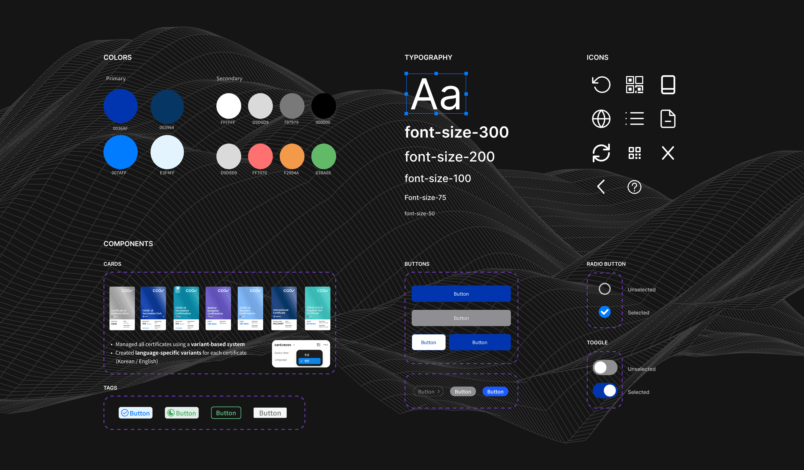
The color system was inspired by the Korean passport, a strong visual symbol of south Korea's national identity and trust. By referencing a familiar and authoritative artifact, the UI helped citizens intuitively recognize the certificate as an official and reliable vaccination credential.
After completing the full set of screens, I initiated the design system to ensure consistency and scalability across the product, designing vaccination certificate components and variants, which needed to support both Korean and English.
For example, more than eight different card designs in the vaccination certificate category, resulting in over 6,500 possible UI combinations (6,561 in total).

Designing in Parallel with Development
Designing in Parallel with Development
Due to the urgency of the project, development needed to move quickly. After the mid-fidelity wireframes were established, the team began building the backend and structuring the frontend in parallel using Figma. Design and development progressed almost simultaneously, requiring close coordination across teams.
Due to the urgency of the project, development needed to move quickly. After the mid-fidelity wireframes were established, the team began building the backend and structuring the frontend in parallel using Figma. Design and development progressed almost simultaneously, requiring close coordination across teams.
Final Design: UI & Core Flows
Final Design: UI & Core Flows
Designing for Trust in Real World Use.
Designing for Trust in Real World Use.
From Document To Card
One Tap Vaccination Certificate Experiences
⛔️ Problems
Medical information was complex and hard to interpret quickly.
Users were unsure where to find or present their certificate in urgent situations.
✅ Design Decision
Simplified vaccination status into clear visual signals (color, labels, hierarchy).
Located vaccination certificate card on first screen, enabling key actions with a single, always accessible interface.
Built a scalable system that allows users to store and manage multiple certificates over time.
📈 Outcome
Reduced proof presentation time from 45 seconds to 5 seconds, enabling fast, confident verification in high-pressure environments.
Drove word of mouth adoption among citizens, increasing vaccination uptake and shifting public perception positively, reflected in a 4.6/5 App Store rating.
Data Control By User
Privacy control by users who owns
⛔️ Problems
Users hesitated to share vaccination proof due to overexposure of sensitive personal and medical information.
✅ Design Decision
Detailed vaccination information is accessible with a single tap on the card, protecting user information privacy.
User can decide which personal and medical data they want to submit or protect, and these preferences are automatically applied to the QR code.
📈 Outcome
Encouraged by citizens for many uses.
One of First product that data is on user's hand.
International Uses
Enabling Free Travel During the Pandemic
⛔️ Problems
Vaccination certificates needed to work across borders, but formats and standards varied by country
Lack of alignment between certificate data and passport identity systems
Caused confusion, delays, and low trust during international travel especially critical in high-pressure environments like airports
✅ Design Decision
Designed an international certificate experience aligned with global expectations
Connected vaccination records with passport based identity verification
📈 Outcome
Adopted across regions starting with the EU and Singapore, expanding to the U.S. and broader Asia.
Reduced confusion and processing time at airports.


Then How can other countries verify COOV app users?
Then How can other countries verify COOV app users?
The main users were airport officers. I focused on role based access for global airport officers, including hidden entry points.
I chose to embed this access within the language settings, where users could scroll to the bottom and enter a passcode shared only with authorized officials.
The system was adopted across 29+ countries globally, including the EU, Singapore, and the United States.
Official only access with restricted permissions
Instant QR scanning optimized for high-volume checkpoints
Clear pass / fail status with no interpretation required
Minimal data exposure to protect traveler privacy
Consistent verification rules across regions and authorities
Official only access with restricted permissions
Instant QR scanning optimized for high volume checkpoints
Clear pass / fail status with no interpretation required
Minimal data exposure to protect traveler privacy
Consistent verification rules across regions and authorities
Design Framework
I grounded every design decision in a structured framework balancing accuracy vs. usability, and security vs. accessibility based on context and use case. I treated each trade off as a design constraint to be mapped, distinguishing where precision was mandatory and where usability could be optimized without compromising trust.
No Sign up, No personal Information
Identity Authentication
No Sign up, No personal Information
Identity Authentication
I designed the authentication CTA to create a clear and trustworthy entry point, and led collaboration with telecom and platform partners to enable the identity verification flow.
I designed the authentication CTA to create a clear and trustworthy entry point, and led collaboration with telecom and platform partners to enable the identity verification flow.
COOV 2.0 Update
Focused on Certification Check-in & Verification
COOV 2.0 Update,
Check-in & Verification
By introducing a unified QR check in flow, the entry time was 10 time faster which reduced from 45 seconds to 3 seconds per visit.
Also, a QR based check-in service replaced handwritten visitor logs at restaurants, cafés, hospitals, and other public venues with a digital system.
By introducing a unified QR check in flow, the entry time was 10 time faster which reduced from 45 seconds to 3 seconds per visit.
Also, a QR based check-in service replaced handwritten visitor logs at restaurants, cafés, hospitals, and other public venues with a digital system.
Impact
Cut policy response time by ~90%, from 10–14 days to 1 day, by embedding a weekly Notion based ops cadence that synced design, engineering, and ministry teams.
Retained 60%+ user engagement on the in app vaccine booking feature.
Enabled 1M+ real time verifications per day without central server dependency.
Increased user verification success rate by 27% through mobile first authentication.
First government app to achieve the highest number of downloads, with a 4.6/5 rating on app stores.
Learnings
Learnings
Working in a policy driven domain taught me that empathy isn’t just about users; it’s also about understanding process, regulation, and systemic constraints. For me, empathy now includes institutional empathy designing solutions that work for people, organizations, and governance systems alike. In future work, I will prioritize empathy for context as much as empathy for users.
What I remember most isn’t the scale, but the people. Late night Slack threads, tough trade off calls, and that quiet sense of being in it together. The work was complex, but somehow we made it work by staying aligned. I was part of a team I’d gladly build with again.


I love turning complexity into intuitive design. Now building with AI in the Bay Area. Always open to great conversations and new connections.
Let's talk!
I love turning complexity into intuitive design. Now building with AI in the Bay Area. Always open to great conversations and new connections. Let's talk!
EXPLORE
EXPLORE
©2026 Alice Choi. All rights reserved.
©2026 Alice Choi. All rights reserved.